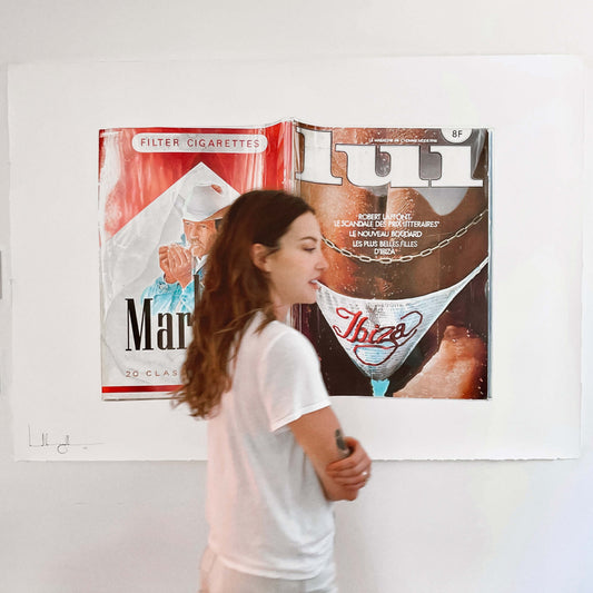
Contemplating if the sun-drenched sleazy 80’s are more my aesthetic counterpart than my modern surroundings. The days when we could freely objectify women, or at least the most beautiful women in Ibiza, and smoke to our big strong (male) lungs content.
The size of a piece is of substantial importance for me, it changes the entire process. I hadn’t gone this large for a while so this piece felt like an indulgence. The water droplets hanging off the hairs of the girl's stomach were a test. It’s interesting, my hand tends to contrast things more in the drawing than what reality depicts. I think sometimes this leans my work into the hyper realistic category, but for this piece, intending to be more realistic than hyper, I had to go back over parts of the drawing and soften the highlights and shadows. Particularly on those hairs.
Another test was drawing the Marlboro man's face, which was already a painted face from the advertisement. Trying to be honest to the ad, I had to restrain myself from trying to “fix” the face into looking more realistic and less like the artwork before me. I’m not used drawing people in my work - give me still life! I wasn’t sure the protective plastic sleeve/cover would translate. With its lack of overlap and standing on its own, I wanted to make sure it looked like a protective layer rather than just a reflective cover.
It’s important the piece depicts itself as an artifact of the past, a piece of trash culture history, just as important as noble literature from the 80’s. It’s a layer of plastic to protect the image, mirroring the way my artwork will be framed. We can not put our dirty hands on such artifacts! We must protect things we love from ourselves, the dirty users.